📱 iOS app UI starter. Paste the design link below into Claude Code, Rork, Lovable, or your AI app builder and ask it to start from this design. These are UI starters. Add your own backend/data logic.
Orbit — Messages
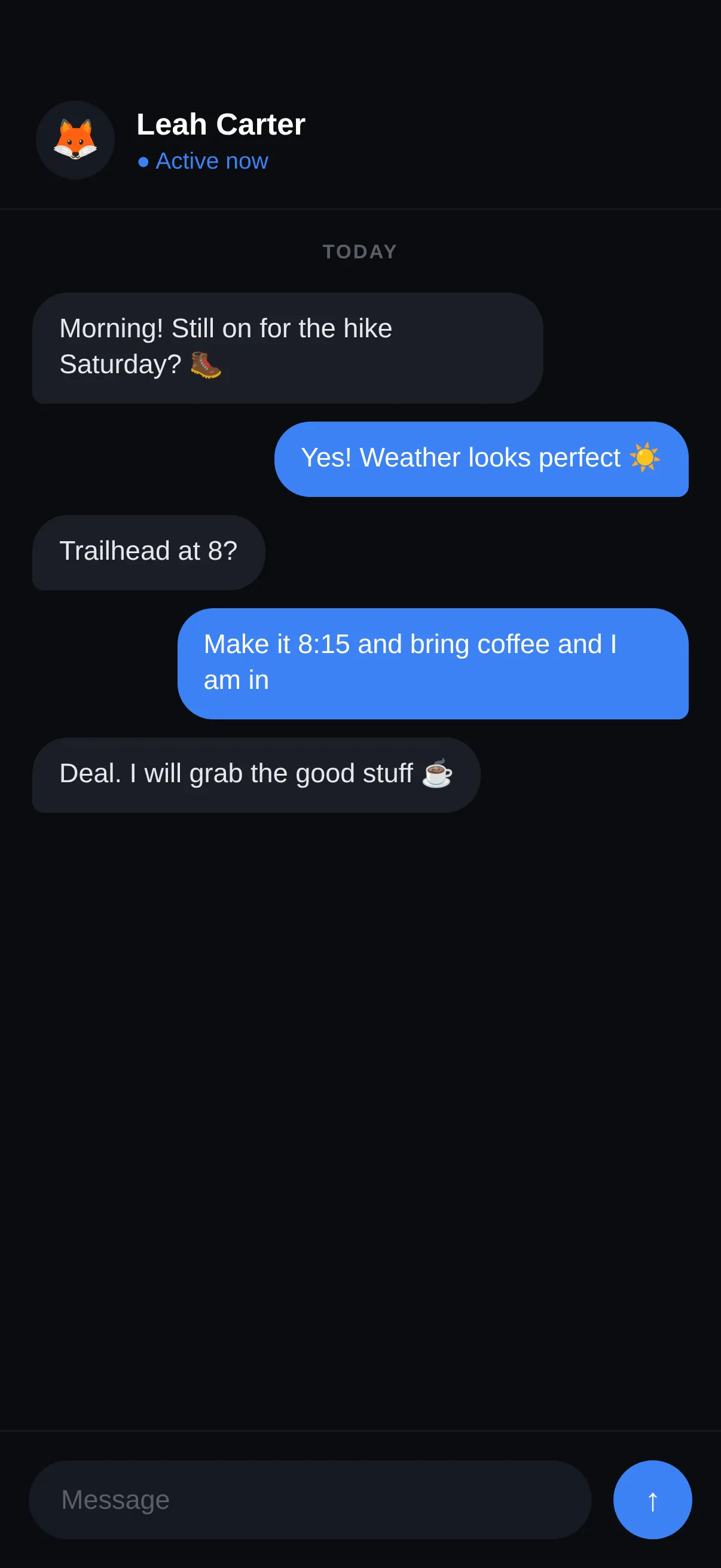
A warm messaging thread with bubbles, reactions, and a clean composer.
#Dark #Social #Messaging
https://vp0.com/source/orbit-messagesnpx vp0com add orbit-messages --target react-nativeOr skip the paste
Install the free VP0 MCP once and your AI builder can search and import any design by name, with no link to copy and no API key.
claude mcp add vp0 -- npx -y vp0-mcp{
"mcpServers": {
"vp0": { "command": "npx", "args": ["-y", "vp0-mcp"] }
}
}Use with AI
Build this iOS app design in my project: "Orbit — Messages" — A warm messaging thread with bubbles, reactions, and a clean composer.. 1. Fetch https://api.vp0.com/designs/orbit-messages/manifest — a JSON manifest whose files[] array contains EVERY source file inline (path + content). 2. Create each file at its exact files[].path and paste its content VERBATIM. Do not re-imagine or restyle the UI — the provided code IS the design. 3. Install dependencies exactly as given by the manifest's installCommand field (skip if null). 4. Render the entry component (targets[].entrypoint) from a screen. Keep SafeAreaView / safe-area insets and the existing styling untouched. 5. It is a UI starter: once it renders pixel-perfect, wire my own data, navigation and backend on top. Human-readable source page: https://vp0.com/source/orbit-messages
This is an iOS app UI starter for Expo React Native ("Orbit — Messages").
Integrate it into the user's Expo project as follows:
1. No extra dependencies are required.
2. Create the following file(s) and paste each provided "content" exactly:
   - App.tsx
3. Render the exported component from a screen (e.g. app/(tabs)/index.tsx). It targets iOS — keep SafeAreaView / safe-area insets and the existing styling.
4. These are UI starters: reproduce the visual layout faithfully, then wire the user's own data/navigation/backend afterward.
Preview
Code · 1 file
React Nativeimport React from 'react';
import { View, Text, ScrollView, StyleSheet, SafeAreaView } from 'react-native';
const MSGS = [
{ me: false, text: 'Morning! Still on for the hike Saturday? 🥾', time: '9:02' },
{ me: true, text: 'Yes! Weather looks perfect ☀️', time: '9:04' },
{ me: false, text: 'Trailhead at 8?' , time: '9:04' },
{ me: true, text: 'Make it 8:15 and bring coffee and I am in', time: '9:06' },
{ me: false, text: 'Deal. I will grab the good stuff ☕', time: '9:07' },
];
export default function App() {
return (
<SafeAreaView style={s.safe}>
<View style={s.header}>
<View style={s.av}><Text style={{ fontSize: 22 }}>🦊</Text></View>
<View>
<Text style={s.name}>Leah Carter</Text>
<Text style={s.status}>● Active now</Text>
</View>
</View>
<ScrollView contentContainerStyle={s.scroll} showsVerticalScrollIndicator={false}>
<Text style={s.day}>TODAY</Text>
{MSGS.map((m, i) => (
<View key={i} style={[s.bubbleRow, m.me ? s.right : s.left]}>
<View style={[s.bubble, m.me ? s.bubbleMe : s.bubbleThem]}>
<Text style={[s.text, m.me && { color: '#fff' }]}>{m.text}</Text>
</View>
</View>
))}
</ScrollView>
<View style={s.composer}>
<View style={s.input}><Text style={s.placeholder}>Message</Text></View>
<View style={s.send}><Text style={{ color: '#fff', fontSize: 18, fontWeight: '800' }}>↑</Text></View>
</View>
</SafeAreaView>
);
}
const s = StyleSheet.create({
safe: { flex: 1, backgroundColor: '#0A0C10' },
header: { flexDirection: 'row', alignItems: 'center', paddingTop: 56, paddingBottom: 16, paddingHorizontal: 20, borderBottomWidth: 1, borderBottomColor: '#16181E' },
av: { width: 44, height: 44, borderRadius: 22, backgroundColor: '#161A22', alignItems: 'center', justifyContent: 'center', marginRight: 12 },
name: { color: '#fff', fontSize: 17, fontWeight: '700' },
status: { color: '#3B82F6', fontSize: 13, marginTop: 2 },
scroll: { padding: 18, paddingBottom: 8 },
day: { color: '#5A5E68', fontSize: 11, fontWeight: '700', textAlign: 'center', marginBottom: 16, letterSpacing: 1 },
bubbleRow: { flexDirection: 'row', marginBottom: 10 },
left: { justifyContent: 'flex-start' },
right: { justifyContent: 'flex-end' },
bubble: { maxWidth: '78%', borderRadius: 20, paddingVertical: 11, paddingHorizontal: 15 },
bubbleThem: { backgroundColor: '#1A1E26', borderBottomLeftRadius: 6 },
bubbleMe: { backgroundColor: '#3B82F6', borderBottomRightRadius: 6 },
text: { color: '#E6E8EE', fontSize: 15, lineHeight: 20 },
composer: { flexDirection: 'row', alignItems: 'center', padding: 16, gap: 12, borderTopWidth: 1, borderTopColor: '#16181E' },
input: { flex: 1, height: 44, borderRadius: 22, backgroundColor: '#161A22', justifyContent: 'center', paddingHorizontal: 18 },
placeholder: { color: '#5A5E68', fontSize: 15 },
send: { width: 44, height: 44, borderRadius: 22, backgroundColor: '#3B82F6', alignItems: 'center', justifyContent: 'center' },
});
Machine endpoints
- Manifest (JSON):/designs/orbit-messages/manifest
- Registry alias:/r/orbit-messages.json
- File tree:/designs/orbit-messages/files
- Download bundle (.zip):/designs/orbit-messages/bundle.zip
- Bundle JSON Schema:/schema/vp0-bundle.v1.json
- Registry index (all designs):/registry.json
Open, CORS-enabled, no key. React Native is the default target; append ?target=swiftui where SwiftUI is available.