📱 iOS app UI starter. Paste the design link below into Claude Code, Rork, Lovable, or your AI app builder and ask it to start from this design. These are UI starters. Add your own backend/data logic.
Human and curious? This structured page is what coding agents read. See how the whole flow works →
Roast — Coffee Rewards
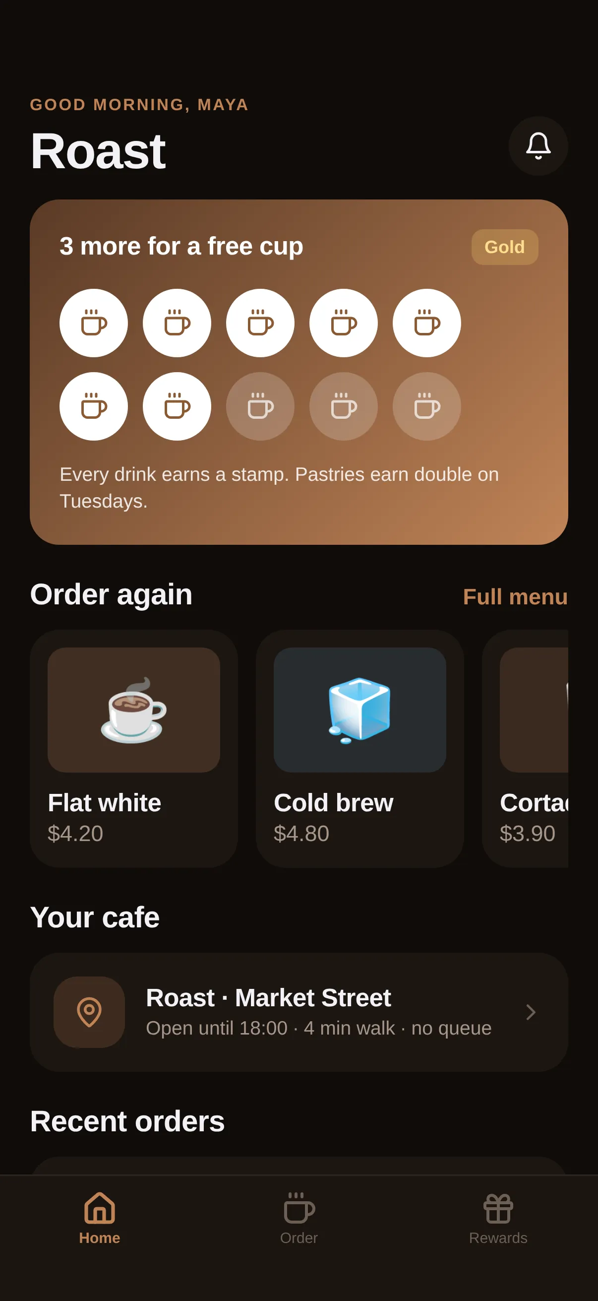
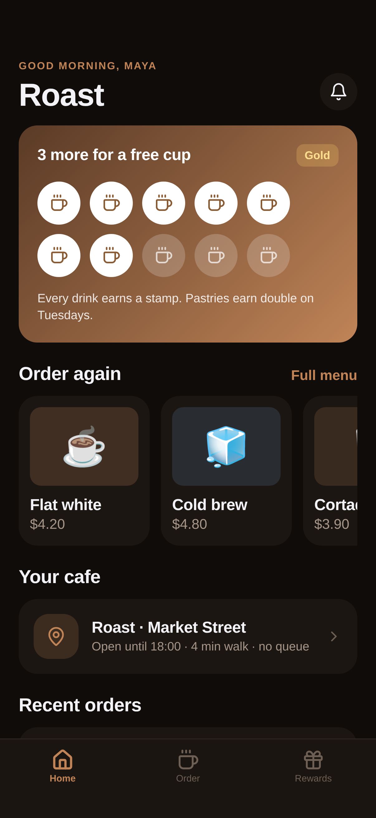
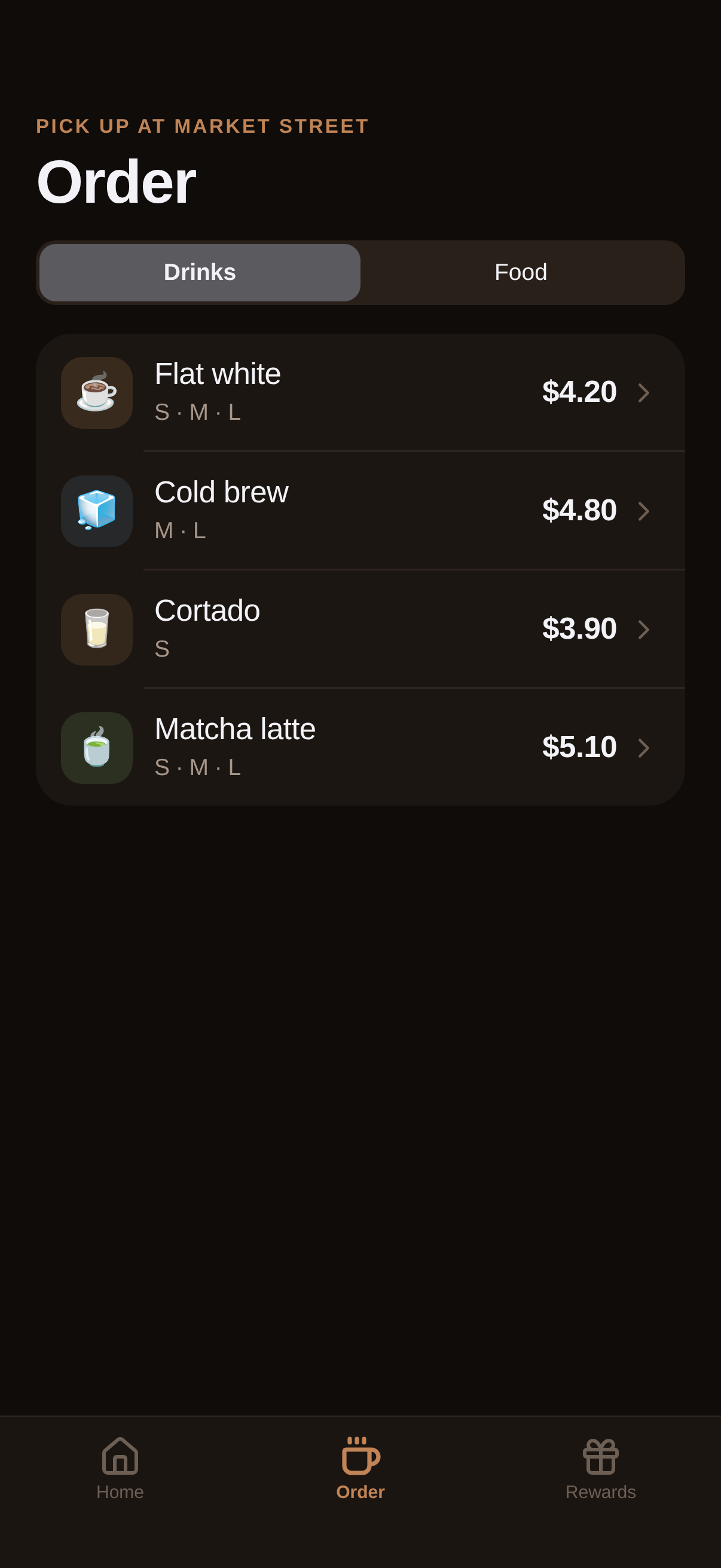
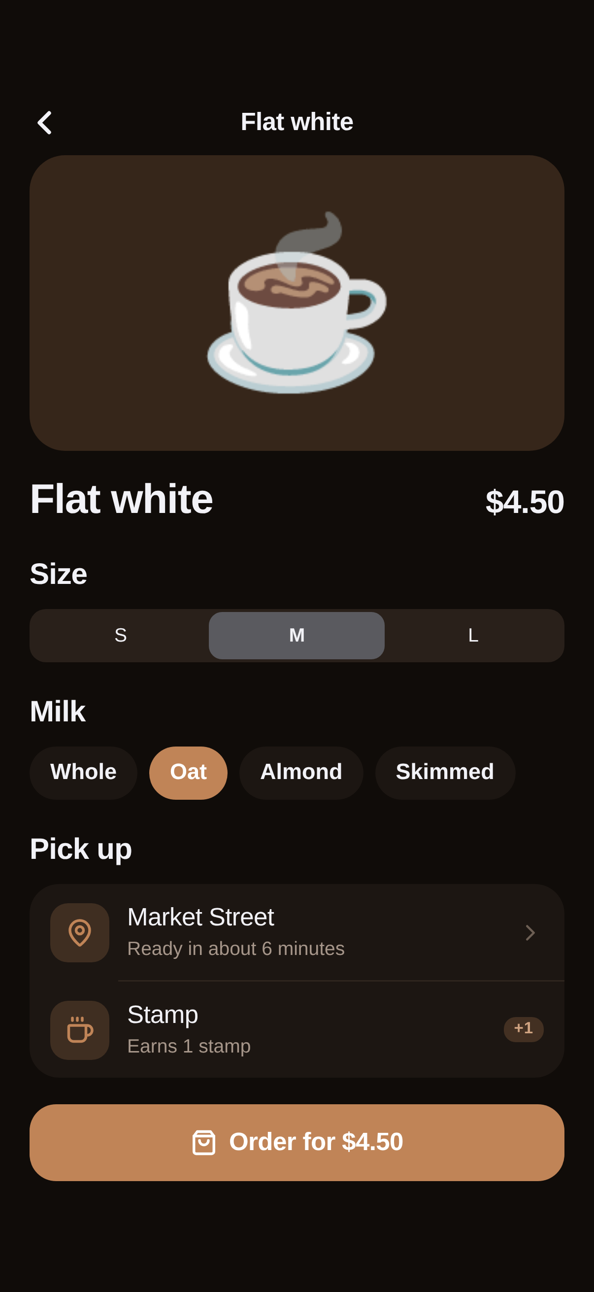
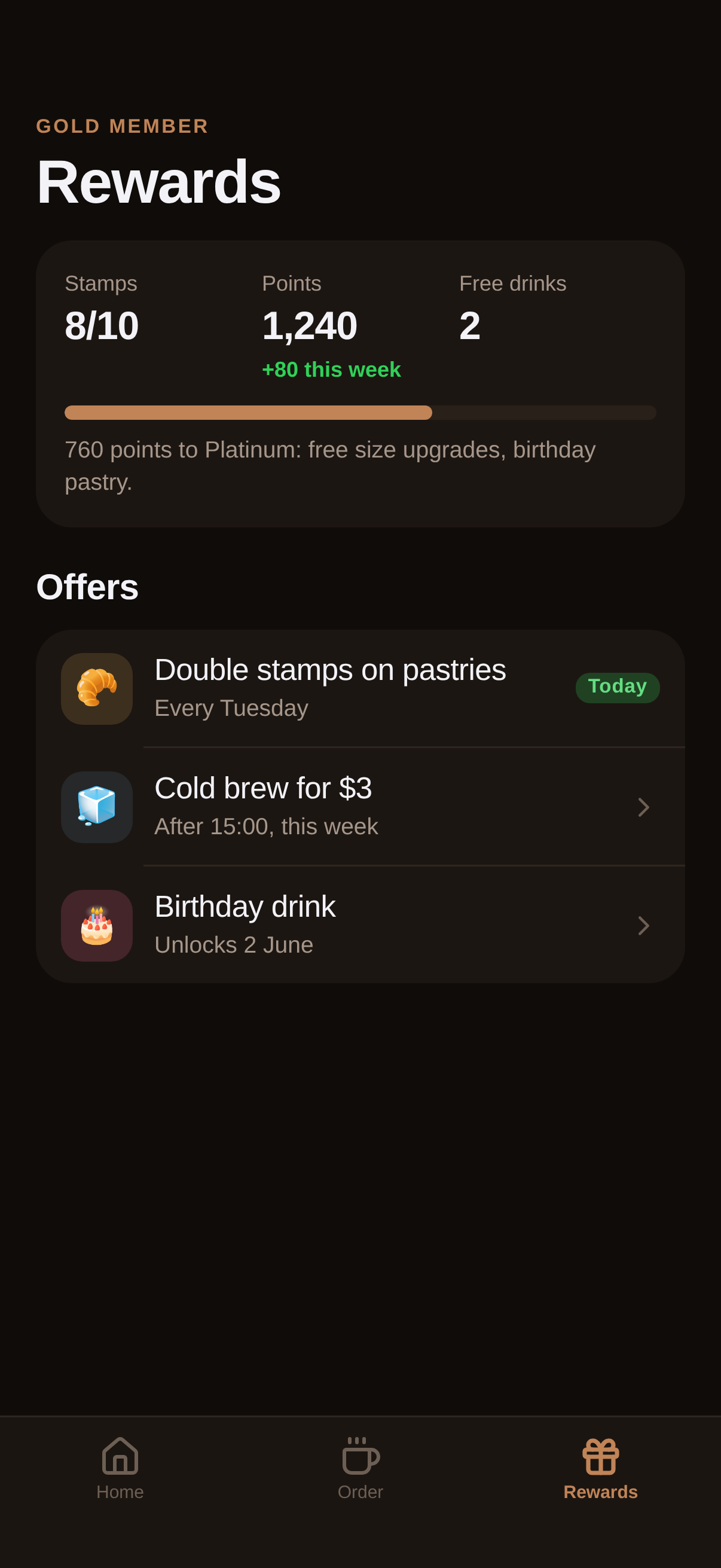
A cafe loyalty app: a stamp card that fills as you order, quick reorder tiles, a menu with size and milk options and pick up, and a rewards screen with points and offers.
#Food #Warm #Loyalty
https://vp0.com/source/roast-coffee-rewardsnpx vp0com add roast-coffee-rewards --target react-nativeOr skip the paste
Install the free VP0 MCP once and your AI builder can search and import any design by name, with no link to copy and no API key.
claude mcp add vp0 -- npx -y vp0-mcp{
"mcpServers": {
"vp0": { "command": "npx", "args": ["-y", "vp0-mcp"] }
}
}Use with AI
Build this iOS app design in my project: "Roast — Coffee Rewards" — A cafe loyalty app: a stamp card that fills as you order, quick reorder tiles, a menu with size and milk options and pick up, and a rewards screen with points and offers.. 1. Fetch https://api.vp0.com/designs/roast-coffee-rewards/manifest — a JSON manifest whose files[] array contains EVERY source file inline (path + content). 2. Create each file at its exact files[].path and paste its content VERBATIM. Do not re-imagine or restyle the UI — the provided code IS the design. 3. Install dependencies exactly as given by the manifest's installCommand field (skip if null). 4. Render the entry component (targets[].entrypoint) from a screen. Keep SafeAreaView / safe-area insets and the existing styling untouched. 5. It is a UI starter: once it renders pixel-perfect, wire my own data, navigation and backend on top. Human-readable source page: https://vp0.com/source/roast-coffee-rewards
This is an iOS app UI starter for Expo React Native ("Roast — Coffee Rewards").
Integrate it into the user's Expo project as follows:
1. No extra dependencies are required.
2. Create the following file(s) and paste each provided "content" exactly:
   - App.tsx
   - ui/kit.tsx
3. Render the exported component from a screen (e.g. app/(tabs)/index.tsx). It targets iOS — keep SafeAreaView / safe-area insets and the existing styling.
4. These are UI starters: reproduce the visual layout faithfully, then wire the user's own data/navigation/backend afterward.
Paste-ready prompts per builder
Claude Code
Build this iOS app design in my project.
If the vp0 MCP server is connected, use its tools to import "roast-coffee-rewards" directly. Otherwise run `npx vp0com add roast-coffee-rewards --target react-native`, or follow the steps below.
1. Fetch https://api.vp0.com/r/roast-coffee-rewards.json: a JSON manifest whose files[] array contains EVERY source file inline (path + content).
2. Create each file at its exact files[].path and paste its content VERBATIM. Do not re-imagine or restyle the UI: the provided code IS the design.
3. Install dependencies exactly as given by the manifest's installCommand field (skip if null).
4. Render the entry component (targets[].entrypoint) from a screen. Keep SafeAreaView / safe-area insets and the existing styling untouched.
5. It is a UI starter: once it renders pixel-perfect, wire my own data, navigation and backend on top.
Human-readable source page: https://vp0.com/source/roast-coffee-rewards
Cursor
Build this iOS app design in my project.
In agent mode, run `npx vp0com add roast-coffee-rewards --target react-native` in the terminal, or follow the steps below.
1. Fetch https://api.vp0.com/r/roast-coffee-rewards.json: a JSON manifest whose files[] array contains EVERY source file inline (path + content).
2. Create each file at its exact files[].path and paste its content VERBATIM. Do not re-imagine or restyle the UI: the provided code IS the design.
3. Install dependencies exactly as given by the manifest's installCommand field (skip if null).
4. Render the entry component (targets[].entrypoint) from a screen. Keep SafeAreaView / safe-area insets and the existing styling untouched.
5. It is a UI starter: once it renders pixel-perfect, wire my own data, navigation and backend on top.
Human-readable source page: https://vp0.com/source/roast-coffee-rewards
Rork
Build this iOS app design in my project. It is React Native (Expo-compatible), so use the files as-is.
1. Fetch https://api.vp0.com/r/roast-coffee-rewards.json: a JSON manifest whose files[] array contains EVERY source file inline (path + content).
2. Create each file at its exact files[].path and paste its content VERBATIM. Do not re-imagine or restyle the UI: the provided code IS the design.
3. Install dependencies exactly as given by the manifest's installCommand field (skip if null).
4. Render the entry component (targets[].entrypoint) from a screen. Keep SafeAreaView / safe-area insets and the existing styling untouched.
5. It is a UI starter: once it renders pixel-perfect, wire my own data, navigation and backend on top.
Human-readable source page: https://vp0.com/source/roast-coffee-rewards
Lovable
Build this iOS app design in my project. The source is React Native (Expo-compatible); if your stack differs, recreate every screen faithfully: keep layout, spacing, colors and typography exactly as in the code.
1. Fetch https://api.vp0.com/r/roast-coffee-rewards.json: a JSON manifest whose files[] array contains EVERY source file inline (path + content).
2. Create each file at its exact files[].path and paste its content VERBATIM. Do not re-imagine or restyle the UI: the provided code IS the design.
3. Install dependencies exactly as given by the manifest's installCommand field (skip if null).
4. Render the entry component (targets[].entrypoint) from a screen. Keep SafeAreaView / safe-area insets and the existing styling untouched.
5. It is a UI starter: once it renders pixel-perfect, wire my own data, navigation and backend on top.
Human-readable source page: https://vp0.com/source/roast-coffee-rewards
v0 by Vercel
Recreate this iOS app design. The manifest below contains every source file; keep layout, spacing, colors and typography exactly as in the code.
1. Fetch https://api.vp0.com/r/roast-coffee-rewards.json: a JSON manifest whose files[] array contains EVERY source file inline (path + content).
2. Create each file at its exact files[].path and paste its content VERBATIM. Do not re-imagine or restyle the UI: the provided code IS the design.
3. Install dependencies exactly as given by the manifest's installCommand field (skip if null).
4. Render the entry component (targets[].entrypoint) from a screen. Keep SafeAreaView / safe-area insets and the existing styling untouched.
5. It is a UI starter: once it renders pixel-perfect, wire my own data, navigation and backend on top.
Human-readable source page: https://vp0.com/source/roast-coffee-rewards
Bolt
Build this iOS app design in my project. The source is React Native (Expo-compatible); if your stack differs, recreate every screen faithfully: keep layout, spacing, colors and typography exactly as in the code.
1. Fetch https://api.vp0.com/r/roast-coffee-rewards.json: a JSON manifest whose files[] array contains EVERY source file inline (path + content).
2. Create each file at its exact files[].path and paste its content VERBATIM. Do not re-imagine or restyle the UI: the provided code IS the design.
3. Install dependencies exactly as given by the manifest's installCommand field (skip if null).
4. Render the entry component (targets[].entrypoint) from a screen. Keep SafeAreaView / safe-area insets and the existing styling untouched.
5. It is a UI starter: once it renders pixel-perfect, wire my own data, navigation and backend on top.
Human-readable source page: https://vp0.com/source/roast-coffee-rewards
Replit
Build this iOS app design in my project. The source is React Native (Expo-compatible); if your stack differs, recreate every screen faithfully: keep layout, spacing, colors and typography exactly as in the code.
1. Fetch https://api.vp0.com/r/roast-coffee-rewards.json: a JSON manifest whose files[] array contains EVERY source file inline (path + content).
2. Create each file at its exact files[].path and paste its content VERBATIM. Do not re-imagine or restyle the UI: the provided code IS the design.
3. Install dependencies exactly as given by the manifest's installCommand field (skip if null).
4. Render the entry component (targets[].entrypoint) from a screen. Keep SafeAreaView / safe-area insets and the existing styling untouched.
5. It is a UI starter: once it renders pixel-perfect, wire my own data, navigation and backend on top.
Human-readable source page: https://vp0.com/source/roast-coffee-rewards
Preview
Code · 2 files
React Nativeimport React, { useState, createContext, useContext } from 'react';
import { View, Text, Pressable } from 'react-native';
import { ThemeProvider, useT, T, Screen, Scroll, Header, NavBar, Card, Group, Row, Button, Segmented, Chip, Pill, Stat, Progress, TabBar, Tabs, Stack, Sheet, Icon, Spacer, SectionTitle, Gradient, alpha } from './ui/kit';
const ACCENT = '#C08457';
const THEME = { dark: { bg: '#100C09', card: '#1C1612', card2: '#29201A', line: '#2E251E', text2: '#A6968A', text3: '#6D5F54' }, light: { bg: '#F8F3EE', card: '#FFFFFF', card2: '#EFE4DA' } };
const MENU = [
{ id: 1, name: 'Flat white', price: 4.2, emoji: '☕', c: '#C08457', sizes: ['S', 'M', 'L'] },
{ id: 2, name: 'Cold brew', price: 4.8, emoji: '🧊', c: '#5B7C99', sizes: ['M', 'L'] },
{ id: 3, name: 'Cortado', price: 3.9, emoji: '🥛', c: '#A3734F', sizes: ['S'] },
{ id: 4, name: 'Matcha latte', price: 5.1, emoji: '🍵', c: '#7CA667', sizes: ['S', 'M', 'L'] },
{ id: 5, name: 'Cardamom bun', price: 3.6, emoji: '🥐', c: '#D4A05B', sizes: [] },
{ id: 6, name: 'Banana bread', price: 3.2, emoji: '🍞', c: '#B07B4F', sizes: [] },
];
const Store = createContext(null);
const usd = (n) => '$' + n.toFixed(2);
function HomeScreen({ nav }) {
const t = useT();
const { stamps, orders } = useContext(Store);
const need = 10;
return (
<Scroll pad={0}>
<Header kicker="Good morning, Maya" title="Roast" right={<View style={{ width: 40, height: 40, borderRadius: 20, backgroundColor: t.card, alignItems: 'center', justifyContent: 'center' }}><Icon name="Bell" size={20} /></View>} />
<View style={{ paddingHorizontal: 20 }}>
<Card pad={0} style={{ overflow: 'hidden' }} onPress={() => nav.push('rewards')}>
<Gradient colors={['#5A3A26', '#C08457']} style={{ padding: 20 }}>
<View style={{ flexDirection: 'row', justifyContent: 'space-between', alignItems: 'center' }}>
<Text style={[T.headline, { color: '#fff' }]}>{stamps >= need ? 'Free drink unlocked' : (need - stamps) + ' more for a free cup'}</Text>
<Pill label="Gold" color="#FFD36A" />
</View>
<View style={{ flexDirection: 'row', flexWrap: 'wrap', gap: 10, marginTop: 16 }}>
{Array.from({ length: need }).map((_, i) => (
<View key={i} style={{ width: 46, height: 46, borderRadius: 23, backgroundColor: i < stamps ? '#fff' : alpha('#fff', 0.2), alignItems: 'center', justifyContent: 'center' }}>
<Icon name="Coffee" size={20} color={i < stamps ? '#8A5A33' : alpha('#fff', 0.7)} />
</View>
))}
</View>
<Text style={[T.footnote, { color: alpha('#fff', 0.85), marginTop: 14 }]}>Every drink earns a stamp. Pastries earn double on Tuesdays.</Text>
</Gradient>
</Card>
<SectionTitle title="Order again" action="Full menu" onAction={() => {}} />
<Scroll horizontal pad={0} contentStyle={{ gap: 12, paddingRight: 20 }}>
{MENU.slice(0, 4).map((m) => (
<Card key={m.id} pad={12} style={{ width: 140 }} onPress={() => nav.push('item', { id: m.id })}>
<View style={{ height: 84, borderRadius: 12, backgroundColor: alpha(m.c, t.isDark ? 0.22 : 0.16), alignItems: 'center', justifyContent: 'center' }}><Text style={{ fontSize: 40 }}>{m.emoji}</Text></View>
<Text style={[T.headline, { color: t.text, marginTop: 10 }]} numberOfLines={1}>{m.name}</Text>
<Text style={[T.subhead, T.num, { color: t.text2 }]}>{usd(m.price)}</Text>
</Card>
))}
</Scroll>
<SectionTitle title="Your cafe" />
<Card style={{ flexDirection: 'row', alignItems: 'center', gap: 14 }}>
<View style={{ width: 48, height: 48, borderRadius: 16, backgroundColor: alpha(ACCENT, 0.2), alignItems: 'center', justifyContent: 'center' }}><Icon name="MapPin" size={22} color={ACCENT} /></View>
<View style={{ flex: 1 }}><Text style={[T.headline, { color: t.text }]}>Roast · Market Street</Text><Text style={[T.footnote, { color: t.text2 }]}>Open until 18:00 · 4 min walk · no queue</Text></View>
<Icon name="ChevronRight" size={18} color={t.text3} />
</Card>
<SectionTitle title="Recent orders" />
<Group>
{orders.map((o, i) => <Row key={i} emoji={o.emoji} iconBg={alpha(o.c, 0.18)} title={o.name} subtitle={o.when} value={usd(o.price)} />)}
</Group>
</View>
</Scroll>
);
}
function OrderScreen({ nav }) {
const t = useT();
const [cat, setCat] = useState('Drinks');
const list = MENU.filter((m) => (cat === 'Drinks' ? m.sizes.length > 0 : m.sizes.length === 0));
return (
<Scroll pad={0}>
<Header kicker="Pick up at Market Street" title="Order" />
<View style={{ paddingHorizontal: 20 }}>
<Segmented options={['Drinks', 'Food']} value={cat} onChange={setCat} />
<Spacer h={16} />
<Group>
{list.map((m) => <Row key={m.id} emoji={m.emoji} iconBg={alpha(m.c, 0.18)} title={m.name} subtitle={m.sizes.length ? m.sizes.join(' · ') : 'Baked this morning'} value={usd(m.price)} chevron onPress={() => nav.push('item', { id: m.id })} />)}
</Group>
</View>
</Scroll>
);
}
function RewardsScreen() {
const t = useT();
const { stamps } = useContext(Store);
return (
<Scroll pad={0}>
<Header kicker="Gold member" title="Rewards" />
<View style={{ paddingHorizontal: 20 }}>
<Card>
<View style={{ flexDirection: 'row' }}>
<Stat label="Stamps" value={stamps + '/10'} />
<Stat label="Points" value="1,240" delta="+80 this week" />
<Stat label="Free drinks" value="2" />
</View>
<Spacer h={12} />
<Progress value={1240 / 2000} />
<Text style={[T.footnote, { color: t.text2, marginTop: 8 }]}>760 points to Platinum: free size upgrades, birthday pastry.</Text>
</Card>
<SectionTitle title="Offers" />
<Group>
<Row emoji="🥐" iconBg={alpha('#D4A05B', 0.18)} title="Double stamps on pastries" subtitle="Every Tuesday" right={<Pill label="Today" color={t.success} small />} />
<Row emoji="🧊" iconBg={alpha('#5B7C99', 0.18)} title="Cold brew for $3" subtitle="After 15:00, this week" chevron onPress={() => {}} />
<Row emoji="🎂" iconBg={alpha('#FF6B9D', 0.18)} title="Birthday drink" subtitle="Unlocks 2 June" chevron onPress={() => {}} />
</Group>
</View>
</Scroll>
);
}
function ItemDetail({ nav, params }) {
const t = useT();
const { order } = useContext(Store);
const m = MENU.find((x) => x.id === params.id) || MENU[0];
const [size, setSize] = useState(m.sizes[1] || m.sizes[0] || '');
const [milk, setMilk] = useState('Oat');
const [done, setDone] = useState(false);
const extra = size === 'L' ? 0.6 : size === 'M' ? 0.3 : 0;
return (
<Screen>
<NavBar title={m.name} onBack={nav.pop} />
<Scroll pad={20}>
<View style={{ height: 200, borderRadius: 24, backgroundColor: alpha(m.c, t.isDark ? 0.22 : 0.16), alignItems: 'center', justifyContent: 'center' }}><Text style={{ fontSize: 110 }}>{m.emoji}</Text></View>
<View style={{ flexDirection: 'row', justifyContent: 'space-between', alignItems: 'baseline', marginTop: 16 }}>
<Text style={[T.title1, { color: t.text }]}>{m.name}</Text>
<Text style={[T.title2, T.num, { color: t.text }]}>{usd(m.price + extra)}</Text>
</View>
{m.sizes.length ? (
<View>
<SectionTitle title="Size" />
<Segmented options={m.sizes} value={size} onChange={setSize} />
<SectionTitle title="Milk" />
<View style={{ flexDirection: 'row', gap: 8, flexWrap: 'wrap' }}>
{['Whole', 'Oat', 'Almond', 'Skimmed'].map((x) => <Chip key={x} label={x} active={milk === x} onPress={() => setMilk(x)} />)}
</View>
</View>
) : null}
<SectionTitle title="Pick up" />
<Group>
<Row icon="MapPin" title="Market Street" subtitle="Ready in about 6 minutes" chevron onPress={() => {}} />
<Row icon="Coffee" title="Stamp" subtitle="Earns 1 stamp" right={<Pill label="+1" color={ACCENT} small />} />
</Group>
<Spacer h={18} />
<Button label={done ? 'Order placed' : 'Order for ' + usd(m.price + extra)} icon={done ? 'Check' : 'ShoppingBag'} full onPress={() => { if (!done) { order(m, size); setDone(true); } }} />
</Scroll>
</Screen>
);
}
function RewardsDetail({ nav }) { return <Screen><NavBar title="Rewards" onBack={nav.pop} /><RewardsScreen /></Screen>; }
function Root({ nav }) {
const [tab, setTab] = useState('home');
return (
<Screen>
<Tabs active={tab} screens={{ home: <HomeScreen nav={nav} />, order: <OrderScreen nav={nav} />, rewards: <RewardsScreen /> }} />
<TabBar active={tab} onChange={setTab} tabs={[
{ key: 'home', label: 'Home', icon: 'House' },
{ key: 'order', label: 'Order', icon: 'Coffee' },
{ key: 'rewards', label: 'Rewards', icon: 'Gift' },
]} />
</Screen>
);
}
const SCREENS = { root: Root, item: ItemDetail, rewards: RewardsDetail };
export default function App() {
const [stamps, setStamps] = useState(7);
const [orders, setOrders] = useState([{ name: 'Flat white, M', emoji: '☕', c: '#C08457', price: 4.5, when: 'Yesterday, 08:12' }, { name: 'Cardamom bun', emoji: '🥐', c: '#D4A05B', price: 3.6, when: 'Yesterday, 08:12' }, { name: 'Cold brew, L', emoji: '🧊', c: '#5B7C99', price: 5.4, when: 'Mon, 15:40' }]);
const order = (m, size) => { setStamps((s) => Math.min(10, s + 1)); setOrders((o) => [{ name: m.name + (size ? ', ' + size : ''), emoji: m.emoji, c: m.c, price: m.price, when: 'Just now' }, ...o]); };
return (
<ThemeProvider accent={ACCENT} overrides={THEME}>
<Store.Provider value={{ stamps, orders, order }}>
<Stack screens={SCREENS} initial="root" />
</Store.Provider>
</ThemeProvider>
);
}
import React, { useState, useEffect, useRef, useMemo, createContext, useContext } from 'react';
import { View, Text, Pressable, ScrollView, StyleSheet, Animated, Easing, Modal, Dimensions, useColorScheme, TextInput } from 'react-native';
import { useSafeAreaInsets } from 'react-native-safe-area-context';
import Svg, { Circle, Path, Rect, Line, Polyline, Defs, LinearGradient as SvgGradient, Stop } from 'react-native-svg';
import * as Lucide from 'lucide-react-native';
import { LinearGradient } from 'expo-linear-gradient';

// ─── colour helpers ─────────────────────────────────────────────────────────
export function alpha(hex, a) {
  const h = hex.replace('#', '');
  const n = parseInt(h.length === 3 ? h.split('').map((c) => c + c).join('') : h, 16);
  const r = (n >> 16) & 255, g = (n >> 8) & 255, b = n & 255;
  return 'rgba(' + r + ',' + g + ',' + b + ',' + a + ')';
}
export function mix(hexA, hexB, p) {
  const pa = parseInt(hexA.replace('#', ''), 16), pb = parseInt(hexB.replace('#', ''), 16);
  const ch = (sh) => Math.round(((pa >> sh) & 255) * (1 - p) + ((pb >> sh) & 255) * p);
  const to = (v) => ('0' + v.toString(16)).slice(-2);
  return '#' + to(ch(16)) + to(ch(8)) + to(ch(0));
}
function luminance(hex) {
  const n = parseInt(hex.replace('#', ''), 16);
  const r = (n >> 16) & 255, g = (n >> 8) & 255, b = n & 255;
  return (0.2126 * r + 0.7152 * g + 0.0722 * b) / 255;
}

// ─── theme ──────────────────────────────────────────────────────────────────
const DARK = { bg: '#000000', card: '#1C1C1E', card2: '#2C2C2E', text: '#F2F2F7', text2: '#9A9AA3', text3: '#636369', line: '#2A2A2E' };
const LIGHT = { bg: '#F2F2F7', card: '#FFFFFF', card2: '#EDEDF2', text: '#111114', text2: '#6E6E76', text3: '#A6A6AE', line: '#E3E3E8' };
const SEMANTIC = { success: '#30D158', warning: '#FFB340', danger: '#FF453A', info: '#4DA3FF' };
const ThemeCtx = createContext(null);

export function makeTheme(accent, isDark, overrides) {
  const base = isDark ? DARK : LIGHT;
  const o = (overrides && (isDark ? overrides.dark : overrides.light)) || {};
  const t = Object.assign({}, base, SEMANTIC, o, { accent: accent, isDark: isDark });
  t.onAccent = luminance(accent) > 0.6 ? '#0B0B10' : '#FFFFFF';
  t.accentSoft = alpha(accent, isDark ? 0.22 : 0.14);
  t.accentFaint = alpha(accent, isDark ? 0.12 : 0.08);
  return t;
}
export function ThemeProvider({ accent, overrides, children }) {
  const scheme = useColorScheme();
  const t = useMemo(() => makeTheme(accent, scheme !== 'light', overrides), [accent, scheme, overrides]);
  return <ThemeCtx.Provider value={t}>{children}</ThemeCtx.Provider>;
}
export function useT() {
  const t = useContext(ThemeCtx);
  return t || makeTheme('#7C5CFF', true, null);
}
export const useInsets = useSafeAreaInsets;
export const win = () => Dimensions.get('window');

// ─── type scale (iOS) ───────────────────────────────────────────────────────
export const T = StyleSheet.create({
  largeTitle: { fontSize: 34, fontWeight: '700', letterSpacing: -0.7, lineHeight: 40 },
  title1: { fontSize: 28, fontWeight: '700', letterSpacing: -0.5, lineHeight: 34 },
  title2: { fontSize: 22, fontWeight: '700', letterSpacing: -0.35, lineHeight: 28 },
  title3: { fontSize: 20, fontWeight: '600', letterSpacing: -0.25, lineHeight: 25 },
  headline: { fontSize: 17, fontWeight: '600', letterSpacing: -0.2, lineHeight: 22 },
  body: { fontSize: 17, fontWeight: '400', letterSpacing: -0.2, lineHeight: 22 },
  callout: { fontSize: 16, fontWeight: '400', lineHeight: 21 },
  subhead: { fontSize: 15, fontWeight: '400', lineHeight: 20 },
  footnote: { fontSize: 13, fontWeight: '400', lineHeight: 18 },
  caption: { fontSize: 12, fontWeight: '500', lineHeight: 16 },
  caption2: { fontSize: 11, fontWeight: '600', lineHeight: 13, letterSpacing: 0.3 },
  num: { fontVariant: ['tabular-nums'] },
});

// ─── motion ─────────────────────────────────────────────────────────────────
export function useTween(target, ms) {
  const dur = ms || 650;
  const [v, setV] = useState(target);
  const ref = useRef({ raf: 0 });
  useEffect(() => {
    const from = v, to = target, t0 = Date.now();
    if (from === to) return;
    cancelAnimationFrame(ref.current.raf);
    const tick = () => {
      const p = Math.min(1, (Date.now() - t0) / dur);
      const e = 1 - Math.pow(1 - p, 3);
      setV(from + (to - from) * e);
      if (p < 1) ref.current.raf = requestAnimationFrame(tick);
    };
    ref.current.raf = requestAnimationFrame(tick);
    return () => cancelAnimationFrame(ref.current.raf);
  }, [target]);
  return v;
}
export function usePressScale(to) {
  const scale = useRef(new Animated.Value(1)).current;
  const onPressIn = () => Animated.spring(scale, { toValue: to || 0.96, useNativeDriver: false, speed: 40, bounciness: 2 }).start();
  const onPressOut = () => Animated.spring(scale, { toValue: 1, useNativeDriver: false, speed: 20, bounciness: 8 }).start();
  return { scale, onPressIn, onPressOut };
}

// ─── icons ──────────────────────────────────────────────────────────────────
export function Icon({ name, size, color, strokeWidth, fill, style }) {
  const t = useT();
  const Cmp = Lucide[name] || Lucide.Circle;
  return <Cmp size={size || 22} color={color || t.text} strokeWidth={strokeWidth || 2} fill={fill || 'none'} style={style} />;
}

// ─── layout primitives ──────────────────────────────────────────────────────
export function Screen({ children, style, bg }) {
  const t = useT();
  return <View style={[{ flex: 1, backgroundColor: bg || t.bg }, style]}>{children}</View>;
}
export function Scroll({ children, style, contentStyle, pad, horizontal, bottom }) {
  const p = pad == null ? 20 : pad;
  return (
    <ScrollView
      horizontal={!!horizontal}
      style={[{ flex: 1 }, style]}
      showsVerticalScrollIndicator={false}
      showsHorizontalScrollIndicator={false}
      contentContainerStyle={[horizontal ? { paddingHorizontal: p, gap: 12 } : { paddingHorizontal: p, paddingBottom: bottom == null ? 28 : bottom }, contentStyle]}
    >
      {children}
    </ScrollView>
  );
}
export function Spacer({ h, w }) { return <View style={{ height: h || 0, width: w || 0 }} />; }
export function Divider({ inset, style }) {
  const t = useT();
  return <View style={[{ height: StyleSheet.hairlineWidth, backgroundColor: t.line, marginLeft: inset || 0 }, style]} />;
}

/** Large-title header for a tab/root screen: kicker, 34pt title, optional trailing slot. */
export function Header({ kicker, title, subtitle, right, style, kickerColor }) {
  const t = useT();
  const ins = useInsets();
  return (
    <View style={[{ paddingTop: ins.top + 6, paddingHorizontal: 20, paddingBottom: 12, flexDirection: 'row', alignItems: 'flex-end', justifyContent: 'space-between' }, style]}>
      <View style={{ flex: 1, minWidth: 0 }}>
        {kicker ? <Text style={[T.caption2, { color: kickerColor || t.accent, textTransform: 'uppercase', letterSpacing: 1.2, marginBottom: 4 }]}>{kicker}</Text> : null}
        <Text style={[T.largeTitle, { color: t.text }]} numberOfLines={1}>{title}</Text>
        {subtitle ? <Text style={[T.subhead, { color: t.text2, marginTop: 3 }]}>{subtitle}</Text> : null}
      </View>
      {right ? <View style={{ marginLeft: 12, marginBottom: 4 }}>{right}</View> : null}
    </View>
  );
}

/** Inline navigation bar for a pushed screen: back chevron, centred title, trailing slot. */
export function NavBar({ title, onBack, right, transparent, tint }) {
  const t = useT();
  const ins = useInsets();
  const color = tint || t.text;
  return (
    <View style={{ paddingTop: ins.top + 2, height: ins.top + 46, flexDirection: 'row', alignItems: 'center', paddingHorizontal: 8, backgroundColor: transparent ? 'transparent' : t.bg }}>
      <Pressable onPress={onBack} hitSlop={10} style={({ pressed }) => [{ width: 44, height: 40, alignItems: 'center', justifyContent: 'center', borderRadius: 20 }, pressed && { opacity: 0.5 }]}>
        <Icon name="ChevronLeft" size={26} color={color} strokeWidth={2.4} />
      </Pressable>
      <Text style={[T.headline, { color: color, flex: 1, textAlign: 'center' }]} numberOfLines={1}>{title}</Text>
      <View style={{ width: 44, alignItems: 'flex-end' }}>{right || null}</View>
    </View>
  );
}

/** Section label (iOS grouped header) with optional trailing action. */
export function SectionTitle({ title, action, onAction, style }) {
  const t = useT();
  return (
    <View style={[{ flexDirection: 'row', alignItems: 'baseline', justifyContent: 'space-between', marginTop: 22, marginBottom: 10 }, style]}>
      <Text style={[T.title3, { color: t.text }]}>{title}</Text>
      {action ? (
        <Pressable onPress={onAction} hitSlop={8}>
          <Text style={[T.subhead, { color: t.accent, fontWeight: '600' }]}>{action}</Text>
        </Pressable>
      ) : null}
    </View>
  );
}

export function Card({ children, style, onPress, pad, bg }) {
  const t = useT();
  const base = [{ backgroundColor: bg || t.card, borderRadius: 20, padding: pad == null ? 16 : pad }, style];
  if (!onPress) return <View style={base}>{children}</View>;
  return (
    <Pressable onPress={onPress} style={({ pressed }) => [base, pressed && { opacity: 0.86, transform: [{ scale: 0.985 }] }]}>
      {children}
    </Pressable>
  );
}

/** Inset-grouped list: wraps rows in a card, drawing hairline separators. */
export function Group({ children, style }) {
  const t = useT();
  const kids = React.Children.toArray(children).filter(Boolean);
  return (
    <View style={[{ backgroundColor: t.card, borderRadius: 20, overflow: 'hidden' }, style]}>
      {kids.map((k, i) => (
        <View key={i}>
          {k}
          {i < kids.length - 1 ? <Divider inset={60} /> : null}
        </View>
      ))}
    </View>
  );
}

/** A list row: leading icon tile (lucide or emoji/custom), title, subtitle, trailing value, chevron. */
export function Row({ icon, emoji, iconColor, iconBg, leading, title, subtitle, value, valueColor, sub2, chevron, onPress, right, pad, titleStyle }) {
  const t = useT();
  const body = (
    <View style={{ flexDirection: 'row', alignItems: 'center', paddingVertical: pad == null ? 12 : pad, paddingHorizontal: 14 }}>
      {leading ? leading : (icon || emoji) ? (
        <View style={{ width: 40, height: 40, borderRadius: 12, backgroundColor: iconBg || t.accentSoft, alignItems: 'center', justifyContent: 'center' }}>
          {emoji ? <Text style={{ fontSize: 20 }}>{emoji}</Text> : <Icon name={icon} size={20} color={iconColor || t.accent} strokeWidth={2.2} />}
        </View>
      ) : null}
      <View style={{ flex: 1, minWidth: 0, marginLeft: (leading || icon || emoji) ? 12 : 0 }}>
        <Text style={[T.body, { color: t.text, fontWeight: '500' }, titleStyle]} numberOfLines={1}>{title}</Text>
        {subtitle ? <Text style={[T.footnote, { color: t.text2, marginTop: 1 }]} numberOfLines={1}>{subtitle}</Text> : null}
      </View>
      {value != null ? (
        <View style={{ alignItems: 'flex-end', marginLeft: 10 }}>
          <Text style={[T.body, T.num, { color: valueColor || t.text, fontWeight: '600' }]}>{value}</Text>
          {sub2 ? <Text style={[T.caption, { color: t.text3 }]}>{sub2}</Text> : null}
        </View>
      ) : null}
      {right ? <View style={{ marginLeft: 10 }}>{right}</View> : null}
      {chevron ? <Icon name="ChevronRight" size={18} color={t.text3} style={{ marginLeft: 6 }} /> : null}
    </View>
  );
  if (!onPress) return body;
  return <Pressable onPress={onPress} style={({ pressed }) => [pressed && { backgroundColor: t.card2 }]}>{body}</Pressable>;
}

// ─── controls ───────────────────────────────────────────────────────────────
export function Button({ label, onPress, kind, icon, small, full, color, style, disabled }) {
  const t = useT();
  const { scale, onPressIn, onPressOut } = usePressScale(0.96);
  const k = kind || 'primary';
  const accent = color || t.accent;
  const bg = k === 'primary' ? accent : k === 'secondary' ? t.card2 : k === 'soft' ? alpha(accent, t.isDark ? 0.22 : 0.14) : 'transparent';
  const fg = k === 'primary' ? (luminance(accent) > 0.6 ? '#0B0B10' : '#FFFFFF') : k === 'secondary' ? t.text : accent;
  return (
    <Animated.View style={[{ transform: [{ scale }] }, full && { alignSelf: 'stretch' }, style]}>
      <Pressable
        onPress={onPress}
        onPressIn={onPressIn}
        onPressOut={onPressOut}
        disabled={disabled}
        style={{ backgroundColor: bg, borderRadius: small ? 14 : 18, paddingVertical: small ? 9 : 15, paddingHorizontal: small ? 14 : 20, flexDirection: 'row', alignItems: 'center', justifyContent: 'center', gap: 8, opacity: disabled ? 0.5 : 1 }}
      >
        {icon ? <Icon name={icon} size={small ? 16 : 18} color={fg} strokeWidth={2.4} /> : null}
        <Text style={[small ? T.subhead : T.headline, { color: fg, fontWeight: '600' }]}>{label}</Text>
      </Pressable>
    </Animated.View>
  );
}

export function IconButton({ name, onPress, size, bg, color, style }) {
  const t = useT();
  const s = size || 40;
  return (
    <Pressable onPress={onPress} hitSlop={6} style={({ pressed }) => [{ width: s, height: s, borderRadius: s / 2, backgroundColor: bg || t.card2, alignItems: 'center', justifyContent: 'center' }, pressed && { opacity: 0.6 }, style]}>
      <Icon name={name} size={Math.round(s * 0.5)} color={color || t.text} strokeWidth={2.2} />
    </Pressable>
  );
}

export function Chip({ label, active, onPress, icon, color, style }) {
  const t = useT();
  const c = color || t.accent;
  return (
    <Pressable onPress={onPress} style={({ pressed }) => [{ paddingHorizontal: 14, paddingVertical: 8, borderRadius: 999, backgroundColor: active ? c : t.card, flexDirection: 'row', alignItems: 'center', gap: 6 }, pressed && { opacity: 0.7 }, style]}>
      {icon ? <Icon name={icon} size={14} color={active ? (luminance(c) > 0.6 ? '#0B0B10' : '#fff') : t.text2} strokeWidth={2.4} /> : null}
      <Text style={[T.subhead, { color: active ? (luminance(c) > 0.6 ? '#0B0B10' : '#fff') : t.text, fontWeight: '600' }]}>{label}</Text>
    </Pressable>
  );
}

export function Pill({ label, color, style, small }) {
  const t = useT();
  const c = color || t.accent;
  return (
    <View style={[{ alignSelf: 'flex-start', paddingHorizontal: small ? 7 : 9, paddingVertical: small ? 2 : 4, borderRadius: 8, backgroundColor: alpha(c, t.isDark ? 0.24 : 0.14) }, style]}>
      <Text style={[small ? T.caption2 : T.caption, { color: t.isDark ? mix(c, '#FFFFFF', 0.25) : mix(c, '#000000', 0.2), fontWeight: '700' }]}>{label}</Text>
    </View>
  );
}

/** iOS segmented control with a sliding thumb. */
export function Segmented({ options, value, onChange, style }) {
  const t = useT();
  const idx = Math.max(0, options.findIndex((o) => (o.value == null ? o : o.value) === value));
  const x = useRef(new Animated.Value(idx)).current;
  const [w, setW] = useState(0);
  useEffect(() => { Animated.spring(x, { toValue: idx, useNativeDriver: false, speed: 24, bounciness: 4 }).start(); }, [idx]);
  const segW = options.length ? (w - 4) / options.length : 0;
  return (
    <View onLayout={(e) => setW(e.nativeEvent.layout.width)} style={[{ height: 36, borderRadius: 11, backgroundColor: t.isDark ? t.card2 : '#E2E2E8', padding: 2, flexDirection: 'row' }, style]}>
      {w > 0 ? (
        <Animated.View style={{ position: 'absolute', top: 2, left: 2, width: segW, height: 32, borderRadius: 9, backgroundColor: t.isDark ? '#5A5A5F' : '#FFFFFF', transform: [{ translateX: Animated.multiply(x, segW) }], shadowColor: '#000', shadowOpacity: t.isDark ? 0 : 0.12, shadowRadius: 4, shadowOffset: { width: 0, height: 2 } }} />
      ) : null}
      {options.map((o, i) => {
        const v = o.value == null ? o : o.value;
        const label = o.label == null ? o : o.label;
        return (
          <Pressable key={String(v)} onPress={() => onChange(v)} style={{ flex: 1, alignItems: 'center', justifyContent: 'center' }}>
            <Text style={[T.footnote, { color: t.text, fontWeight: i === idx ? '600' : '500' }]}>{label}</Text>
          </Pressable>
        );
      })}
    </View>
  );
}

/** iOS toggle (own implementation so both appearances look native). */
export function Toggle({ value, onChange, color }) {
  const t = useT();
  const x = useRef(new Animated.Value(value ? 1 : 0)).current;
  useEffect(() => { Animated.spring(x, { toValue: value ? 1 : 0, useNativeDriver: false, speed: 30, bounciness: 3 }).start(); }, [value]);
  const bg = x.interpolate({ inputRange: [0, 1], outputRange: [t.isDark ? '#39393D' : '#E9E9EB', color || t.success] });
  return (
    <Pressable onPress={() => onChange(!value)} hitSlop={8}>
      <Animated.View style={{ width: 51, height: 31, borderRadius: 16, backgroundColor: bg, padding: 2 }}>
        <Animated.View style={{ width: 27, height: 27, borderRadius: 14, backgroundColor: '#fff', transform: [{ translateX: x.interpolate({ inputRange: [0, 1], outputRange: [0, 20] }) }], shadowColor: '#000', shadowOpacity: 0.2, shadowRadius: 3, shadowOffset: { width: 0, height: 2 } }} />
      </Animated.View>
    </Pressable>
  );
}

export function Checkbox({ checked, onChange, color, size }) {
  const t = useT();
  const s = size || 26;
  const c = color || t.accent;
  return (
    <Pressable onPress={() => onChange && onChange(!checked)} hitSlop={8} style={{ width: s, height: s, borderRadius: s / 2, borderWidth: 2, borderColor: checked ? c : t.text3, backgroundColor: checked ? c : 'transparent', alignItems: 'center', justifyContent: 'center' }}>
      {checked ? <Icon name="Check" size={s * 0.6} color={luminance(c) > 0.6 ? '#0B0B10' : '#fff'} strokeWidth={3.2} /> : null}
    </Pressable>
  );
}

export function SearchBar({ placeholder, value, onChange, style }) {
  const t = useT();
  return (
    <View style={[{ height: 40, borderRadius: 12, backgroundColor: t.isDark ? t.card : '#E4E4E9', flexDirection: 'row', alignItems: 'center', paddingHorizontal: 10, gap: 8 }, style]}>
      <Icon name="Search" size={18} color={t.text3} strokeWidth={2.2} />
      <TextInput value={value} onChangeText={onChange} placeholder={placeholder || 'Search'} placeholderTextColor={t.text3} style={[T.body, { flex: 1, color: t.text, paddingVertical: 0 }]} />
    </View>
  );
}

// ─── data display ───────────────────────────────────────────────────────────
export function Stat({ label, value, delta, up, style, color, big }) {
  const t = useT();
  return (
    <View style={[{ flex: 1 }, style]}>
      <Text style={[T.caption, { color: t.text2 }]}>{label}</Text>
      <Text style={[big ? T.title1 : T.title2, T.num, { color: color || t.text, marginTop: 2 }]}>{value}</Text>
      {delta ? <Text style={[T.caption, { color: up === false ? t.danger : t.success, marginTop: 2, fontWeight: '600' }]}>{delta}</Text> : null}
    </View>
  );
}

export function Avatar({ name, size, color, style, uri }) {
  const t = useT();
  const s = size || 40;
  const c = color || t.accent;
  const initials = (name || '?').split(' ').map((p) => p[0]).join('').slice(0, 2).toUpperCase();
  return (
    <View style={[{ width: s, height: s, borderRadius: s / 2, backgroundColor: alpha(c, 0.25), alignItems: 'center', justifyContent: 'center', overflow: 'hidden' }, style]}>
      <View style={{ position: 'absolute', left: -s * 0.2, top: -s * 0.2, width: s * 0.9, height: s * 0.9, borderRadius: s, backgroundColor: alpha(c, 0.35) }} />
      <Text style={{ color: t.isDark ? mix(c, '#FFFFFF', 0.45) : mix(c, '#000000', 0.25), fontSize: s * 0.38, fontWeight: '700' }}>{initials}</Text>
    </View>
  );
}

export function Progress({ value, color, height, track, style }) {
  const t = useT();
  const v = useTween(Math.max(0, Math.min(1, value)));
  const h = height || 8;
  return (
    <View style={[{ height: h, borderRadius: h / 2, backgroundColor: track || t.card2, overflow: 'hidden' }, style]}>
      <View style={{ width: (v * 100) + '%', height: h, borderRadius: h / 2, backgroundColor: color || t.accent }} />
    </View>
  );
}

/** Circular progress ring (SVG). progress 0..1. Children render in the middle. */
export function Ring({ progress, size, stroke, color, track, children, style }) {
  const t = useT();
  const s = size || 160;
  const sw = stroke || 14;
  const r = (s - sw) / 2;
  const c = 2 * Math.PI * r;
  const p = useTween(Math.max(0, Math.min(1, progress)));
  return (
    <View style={[{ width: s, height: s, alignItems: 'center', justifyContent: 'center' }, style]}>
      <Svg width={s} height={s} style={{ position: 'absolute', transform: [{ rotate: '-90deg' }] }}>
        <Circle cx={s / 2} cy={s / 2} r={r} stroke={track || t.card2} strokeWidth={sw} fill="none" />
        <Circle cx={s / 2} cy={s / 2} r={r} stroke={color || t.accent} strokeWidth={sw} fill="none" strokeLinecap="round" strokeDasharray={c + ' ' + c} strokeDashoffset={c * (1 - p)} />
      </Svg>
      {children}
    </View>
  );
}

/** Bar chart (SVG). values: numbers; labels optional; highlight index. */
export function Bars({ values, labels, height, color, dim, highlight, gap, radius, style, max }) {
  const t = useT();
  const h = height || 120;
  const [w, setW] = useState(0);
  const m = max || Math.max(1, ...values);
  const n = values.length;
  const g = gap == null ? 8 : gap;
  const bw = n ? (w - g * (n - 1)) / n : 0;
  const rad = radius == null ? Math.min(6, bw / 2) : radius;
  const lh = labels ? 18 : 0;
  return (
    <View onLayout={(e) => setW(e.nativeEvent.layout.width)} style={[{ height: h + lh }, style]}>
      {w > 0 ? (
        <Svg width={w} height={h}>
          {values.map((v, i) => {
            const bh = Math.max(4, (v / m) * h);
            const on = highlight == null || highlight === i;
            return <Rect key={i} x={i * (bw + g)} y={h - bh} width={bw} height={bh} rx={rad} fill={on ? (color || t.accent) : (dim || t.card2)} />;
          })}
        </Svg>
      ) : null}
      {labels ? (
        <View style={{ flexDirection: 'row', marginTop: 4 }}>
          {labels.map((l, i) => <Text key={i} style={[T.caption2, { color: highlight === i ? t.text : t.text3, flex: 1, textAlign: 'center' }]}>{l}</Text>)}
        </View>
      ) : null}
    </View>
  );
}

/** Sparkline / area line (SVG). */
export function Spark({ values, height, color, fill, stroke, style, dot }) {
  const t = useT();
  const h = height || 80;
  const [w, setW] = useState(0);
  const c = color || t.accent;
  const min = Math.min(...values), max = Math.max(...values);
  const span = max - min || 1;
  const pts = values.map((v, i) => [values.length > 1 ? (i / (values.length - 1)) * w : 0, 6 + (1 - (v - min) / span) * (h - 12)]);
  const d = pts.map((p, i) => (i ? 'L' : 'M') + p[0].toFixed(1) + ' ' + p[1].toFixed(1)).join(' ');
  const area = d + ' L' + w + ' ' + h + ' L0 ' + h + ' Z';
  const last = pts[pts.length - 1] || [0, 0];
  return (
    <View onLayout={(e) => setW(e.nativeEvent.layout.width)} style={[{ height: h }, style]}>
      {w > 0 ? (
        <Svg width={w} height={h}>
          <Defs>
            <SvgGradient id="sparkfill" x1="0" y1="0" x2="0" y2="1">
              <Stop offset="0" stopColor={c} stopOpacity={t.isDark ? 0.35 : 0.25} />
              <Stop offset="1" stopColor={c} stopOpacity="0" />
            </SvgGradient>
          </Defs>
          {fill !== false ? <Path d={area} fill="url(#sparkfill)" /> : null}
          <Path d={d} stroke={c} strokeWidth={stroke || 2.5} fill="none" strokeLinecap="round" strokeLinejoin="round" />
          {dot !== false ? <Circle cx={last[0]} cy={last[1]} r={4} fill={c} stroke={t.card} strokeWidth={2} /> : null}
        </Svg>
      ) : null}
    </View>
  );
}

// ─── navigation ─────────────────────────────────────────────────────────────
/** Bottom tab bar. tabs: [{ key, label, icon }]. */
export function TabBar({ tabs, active, onChange, style, accent }) {
  const t = useT();
  const ins = useInsets();
  const c = accent || t.accent;
  return (
    <View style={[{ paddingBottom: Math.max(ins.bottom, 10), paddingTop: 8, backgroundColor: t.isDark ? alpha(t.card, 0.96) : alpha('#FFFFFF', 0.96), borderTopWidth: StyleSheet.hairlineWidth, borderTopColor: t.line, flexDirection: 'row' }, style]}>
      {tabs.map((tab) => {
        const on = tab.key === active;
        return (
          <Pressable key={tab.key} onPress={() => onChange(tab.key)} style={({ pressed }) => [{ flex: 1, alignItems: 'center', gap: 3, paddingVertical: 2 }, pressed && { opacity: 0.6 }]}>
            <Icon name={tab.icon} size={24} color={on ? c : t.text3} strokeWidth={on ? 2.4 : 2} fill={on && tab.fillOnActive ? c : 'none'} />
            <Text style={[{ fontSize: 10, fontWeight: on ? '600' : '500', color: on ? c : t.text3 }]}>{tab.label}</Text>
          </Pressable>
        );
      })}
    </View>
  );
}

/** Tab screens: every tab stays mounted (state + scroll position survive a switch); only the active one is displayed. */
export function Tabs({ active, screens }) {
  return (
    <View style={{ flex: 1 }}>
      {Object.keys(screens).map((k) => (
        <View key={k} style={{ flex: 1, display: k === active ? 'flex' : 'none' }}>{screens[k]}</View>
      ))}
    </View>
  );
}

/**
 * Minimal navigation stack: screens = { name: Component }, each rendered with
 * { nav: { push, pop, canPop }, params }. Pushed screens slide in from the right
 * while the screen beneath parallaxes left (iOS push transition).
 */
export function Stack({ screens, initial, params }) {
  const t = useT();
  const [stack, setStack] = useState([{ key: 'root', name: initial, params: params || {} }]);
  const [leavingKey, setLeavingKey] = useState(null);
  const nav = useMemo(() => ({
    push: (name, p) => setStack((s) => [...s, { key: name + '-' + Date.now(), name: name, params: p || {} }]),
    pop: () => setStack((s) => { if (s.length > 1) setLeavingKey(s[s.length - 1].key); return s; }),
    reset: (name, p) => setStack([{ key: 'root-' + Date.now(), name: name, params: p || {} }]),
    canPop: stack.length > 1,
  }), [stack.length]);
  const width = win().width;
  const finishPop = (key) => { setStack((s) => s.filter((e) => e.key !== key)); setLeavingKey(null); };
  return (
    <View style={{ flex: 1, overflow: 'hidden', backgroundColor: t.bg }}>
      {stack.map((entry, i) => {
        const Cmp = screens[entry.name];
        const isTop = i === stack.length - 1;
        const under = i === stack.length - 2 && stack.length > 1;
        return (
          <StackLayer key={entry.key} width={width} index={i} isTop={isTop} under={under} leaving={entry.key === leavingKey} onLeft={() => finishPop(entry.key)}>
            {Cmp ? <Cmp nav={nav} params={entry.params} /> : null}
          </StackLayer>
        );
      })}
    </View>
  );
}
function StackLayer({ children, width, index, isTop, under, leaving, onLeft }) {
  const prog = useRef(new Animated.Value(index === 0 ? 1 : 0)).current;
  const t = useT();
  useEffect(() => {
    if (index === 0) return;
    Animated.timing(prog, { toValue: 1, duration: 320, easing: Easing.out(Easing.cubic), useNativeDriver: false }).start();
  }, []);
  useEffect(() => {
    if (!leaving) return;
    Animated.timing(prog, { toValue: 0, duration: 280, easing: Easing.inOut(Easing.cubic), useNativeDriver: false }).start(() => onLeft());
  }, [leaving]);
  const tx = index === 0 ? 0 : prog.interpolate({ inputRange: [0, 1], outputRange: [width, 0] });
  return (
    <Animated.View pointerEvents={isTop ? 'auto' : 'none'} style={[StyleSheet.absoluteFill, { backgroundColor: t.bg, transform: [{ translateX: tx }], shadowColor: '#000', shadowOpacity: index === 0 ? 0 : 0.25, shadowRadius: 16, shadowOffset: { width: -4, height: 0 } }]}>
      {children}
      {under ? <View pointerEvents="none" style={[StyleSheet.absoluteFill, { backgroundColor: alpha('#000000', t.isDark ? 0.35 : 0.12) }]} /> : null}
    </Animated.View>
  );
}

/** Bottom sheet over a dimmed backdrop. */
export function Sheet({ visible, onClose, title, children, height }) {
  const t = useT();
  const ins = useInsets();
  const y = useRef(new Animated.Value(1)).current;
  const [mounted, setMounted] = useState(visible);
  useEffect(() => {
    if (visible) { setMounted(true); Animated.spring(y, { toValue: 0, useNativeDriver: false, speed: 18, bounciness: 2 }).start(); }
    else Animated.timing(y, { toValue: 1, duration: 220, easing: Easing.in(Easing.cubic), useNativeDriver: false }).start(() => setMounted(false));
  }, [visible]);
  if (!mounted) return null;
  const h = height || 420;
  return (
    <Modal transparent visible animationType="none" onRequestClose={onClose}>
      <Pressable onPress={onClose} style={{ flex: 1, backgroundColor: alpha('#000000', 0.45) }} />
      <Animated.View style={{ position: 'absolute', left: 0, right: 0, bottom: 0, height: h + ins.bottom, backgroundColor: t.isDark ? t.card : '#FFFFFF', borderTopLeftRadius: 28, borderTopRightRadius: 28, paddingHorizontal: 20, paddingBottom: ins.bottom + 12, transform: [{ translateY: y.interpolate({ inputRange: [0, 1], outputRange: [0, h + 60] }) }] }}>
        <View style={{ alignSelf: 'center', width: 36, height: 5, borderRadius: 3, backgroundColor: t.text3, opacity: 0.5, marginTop: 8, marginBottom: 12 }} />
        {title ? <Text style={[T.title3, { color: t.text, marginBottom: 12 }]}>{title}</Text> : null}
        {children}
      </Animated.View>
    </Modal>
  );
}

/** Linear gradient surface (expo-linear-gradient, vendored). colors: 2+ hex. */
export function Gradient({ colors, style, children, start, end, angle }) {
  const a = angle == null ? 135 : angle;
  const rad = (a * Math.PI) / 180;
  const s = start || { x: 0.5 - Math.sin(rad) / 2, y: 0.5 + Math.cos(rad) / 2 };
  const e = end || { x: 0.5 + Math.sin(rad) / 2, y: 0.5 - Math.cos(rad) / 2 };
  return <LinearGradient colors={colors} start={s} end={e} style={style}>{children}</LinearGradient>;
}

/** Soft radial-ish glow block for hero areas (two stacked translucent circles). */
export function Glow({ color, size, style, opacity }) {
  const s = size || 260;
  return (
    <View pointerEvents="none" style={[{ position: 'absolute', width: s, height: s, borderRadius: s / 2, backgroundColor: alpha(color, opacity == null ? 0.18 : opacity) }, style]}>
      <View style={{ position: 'absolute', left: s * 0.2, top: s * 0.2, width: s * 0.6, height: s * 0.6, borderRadius: s, backgroundColor: alpha(color, (opacity == null ? 0.18 : opacity) * 0.9) }} />
    </View>
  );
}
Machine endpoints
- Manifest (JSON):/designs/roast-coffee-rewards/manifest
- Registry alias:/r/roast-coffee-rewards.json
- File tree:/designs/roast-coffee-rewards/files
- Download bundle (.zip):/designs/roast-coffee-rewards/bundle.zip
- Bundle JSON Schema:/schema/vp0-bundle.v1.json
- Registry index (all designs):/registry.json
Open, CORS-enabled, no key. React Native is the default target; append ?target=swiftui where SwiftUI is available.