📱 iOS app UI starter. Paste the design link below into Claude Code, Rork, Lovable, or your AI app builder and ask it to start from this design. These are UI starters. Add your own backend/data logic.
Human and curious? This structured page is what coding agents read. See how the whole flow works →
Sprint — Focus Timer
A Pomodoro focus timer with session dots and a clean countdown.
#Dark #Productivity #Minimal #Focus
https://vp0.com/source/sprint-focus-timernpx vp0com add sprint-focus-timer --target react-nativeOr skip the paste
Install the free VP0 MCP once and your AI builder can search and import any design by name, with no link to copy and no API key.
claude mcp add vp0 -- npx -y vp0-mcp{
"mcpServers": {
"vp0": { "command": "npx", "args": ["-y", "vp0-mcp"] }
}
}Use with AI
Build this iOS app design in my project: "Sprint — Focus Timer" — A Pomodoro focus timer with session dots and a clean countdown.. 1. Fetch https://api.vp0.com/designs/sprint-focus-timer/manifest — a JSON manifest whose files[] array contains EVERY source file inline (path + content). 2. Create each file at its exact files[].path and paste its content VERBATIM. Do not re-imagine or restyle the UI — the provided code IS the design. 3. Install dependencies exactly as given by the manifest's installCommand field (skip if null). 4. Render the entry component (targets[].entrypoint) from a screen. Keep SafeAreaView / safe-area insets and the existing styling untouched. 5. It is a UI starter: once it renders pixel-perfect, wire my own data, navigation and backend on top. Human-readable source page: https://vp0.com/source/sprint-focus-timer
This is an iOS app UI starter for Expo React Native ("Sprint — Focus Timer").
Integrate it into the user's Expo project as follows:
1. No extra dependencies are required.
2. Create the following file(s) and paste each provided "content" exactly:
   - App.tsx
3. Render the exported component from a screen (e.g. app/(tabs)/index.tsx). It targets iOS — keep SafeAreaView / safe-area insets and the existing styling.
4. These are UI starters: reproduce the visual layout faithfully, then wire the user's own data/navigation/backend afterward.
Paste-ready prompts per builder
Claude Code
Build this iOS app design in my project.
If the vp0 MCP server is connected, use its tools to import "sprint-focus-timer" directly. Otherwise run `npx vp0com add sprint-focus-timer --target react-native`, or follow the steps below.
1. Fetch https://api.vp0.com/r/sprint-focus-timer.json: a JSON manifest whose files[] array contains EVERY source file inline (path + content).
2. Create each file at its exact files[].path and paste its content VERBATIM. Do not re-imagine or restyle the UI: the provided code IS the design.
3. Install dependencies exactly as given by the manifest's installCommand field (skip if null).
4. Render the entry component (targets[].entrypoint) from a screen. Keep SafeAreaView / safe-area insets and the existing styling untouched.
5. It is a UI starter: once it renders pixel-perfect, wire my own data, navigation and backend on top.
Human-readable source page: https://vp0.com/source/sprint-focus-timer
Cursor
Build this iOS app design in my project.
In agent mode, run `npx vp0com add sprint-focus-timer --target react-native` in the terminal, or follow the steps below.
1. Fetch https://api.vp0.com/r/sprint-focus-timer.json: a JSON manifest whose files[] array contains EVERY source file inline (path + content).
2. Create each file at its exact files[].path and paste its content VERBATIM. Do not re-imagine or restyle the UI: the provided code IS the design.
3. Install dependencies exactly as given by the manifest's installCommand field (skip if null).
4. Render the entry component (targets[].entrypoint) from a screen. Keep SafeAreaView / safe-area insets and the existing styling untouched.
5. It is a UI starter: once it renders pixel-perfect, wire my own data, navigation and backend on top.
Human-readable source page: https://vp0.com/source/sprint-focus-timer
Rork
Build this iOS app design in my project. It is React Native (Expo-compatible), so use the files as-is.
1. Fetch https://api.vp0.com/r/sprint-focus-timer.json: a JSON manifest whose files[] array contains EVERY source file inline (path + content).
2. Create each file at its exact files[].path and paste its content VERBATIM. Do not re-imagine or restyle the UI: the provided code IS the design.
3. Install dependencies exactly as given by the manifest's installCommand field (skip if null).
4. Render the entry component (targets[].entrypoint) from a screen. Keep SafeAreaView / safe-area insets and the existing styling untouched.
5. It is a UI starter: once it renders pixel-perfect, wire my own data, navigation and backend on top.
Human-readable source page: https://vp0.com/source/sprint-focus-timer
Lovable
Build this iOS app design in my project. The source is React Native (Expo-compatible); if your stack differs, recreate every screen faithfully: keep layout, spacing, colors and typography exactly as in the code.
1. Fetch https://api.vp0.com/r/sprint-focus-timer.json: a JSON manifest whose files[] array contains EVERY source file inline (path + content).
2. Create each file at its exact files[].path and paste its content VERBATIM. Do not re-imagine or restyle the UI: the provided code IS the design.
3. Install dependencies exactly as given by the manifest's installCommand field (skip if null).
4. Render the entry component (targets[].entrypoint) from a screen. Keep SafeAreaView / safe-area insets and the existing styling untouched.
5. It is a UI starter: once it renders pixel-perfect, wire my own data, navigation and backend on top.
Human-readable source page: https://vp0.com/source/sprint-focus-timer
v0 by Vercel
Recreate this iOS app design. The manifest below contains every source file; keep layout, spacing, colors and typography exactly as in the code.
1. Fetch https://api.vp0.com/r/sprint-focus-timer.json: a JSON manifest whose files[] array contains EVERY source file inline (path + content).
2. Create each file at its exact files[].path and paste its content VERBATIM. Do not re-imagine or restyle the UI: the provided code IS the design.
3. Install dependencies exactly as given by the manifest's installCommand field (skip if null).
4. Render the entry component (targets[].entrypoint) from a screen. Keep SafeAreaView / safe-area insets and the existing styling untouched.
5. It is a UI starter: once it renders pixel-perfect, wire my own data, navigation and backend on top.
Human-readable source page: https://vp0.com/source/sprint-focus-timer
Bolt
Build this iOS app design in my project. The source is React Native (Expo-compatible); if your stack differs, recreate every screen faithfully: keep layout, spacing, colors and typography exactly as in the code.
1. Fetch https://api.vp0.com/r/sprint-focus-timer.json: a JSON manifest whose files[] array contains EVERY source file inline (path + content).
2. Create each file at its exact files[].path and paste its content VERBATIM. Do not re-imagine or restyle the UI: the provided code IS the design.
3. Install dependencies exactly as given by the manifest's installCommand field (skip if null).
4. Render the entry component (targets[].entrypoint) from a screen. Keep SafeAreaView / safe-area insets and the existing styling untouched.
5. It is a UI starter: once it renders pixel-perfect, wire my own data, navigation and backend on top.
Human-readable source page: https://vp0.com/source/sprint-focus-timer
Replit
Build this iOS app design in my project. The source is React Native (Expo-compatible); if your stack differs, recreate every screen faithfully: keep layout, spacing, colors and typography exactly as in the code.
1. Fetch https://api.vp0.com/r/sprint-focus-timer.json: a JSON manifest whose files[] array contains EVERY source file inline (path + content).
2. Create each file at its exact files[].path and paste its content VERBATIM. Do not re-imagine or restyle the UI: the provided code IS the design.
3. Install dependencies exactly as given by the manifest's installCommand field (skip if null).
4. Render the entry component (targets[].entrypoint) from a screen. Keep SafeAreaView / safe-area insets and the existing styling untouched.
5. It is a UI starter: once it renders pixel-perfect, wire my own data, navigation and backend on top.
Human-readable source page: https://vp0.com/source/sprint-focus-timer
Preview
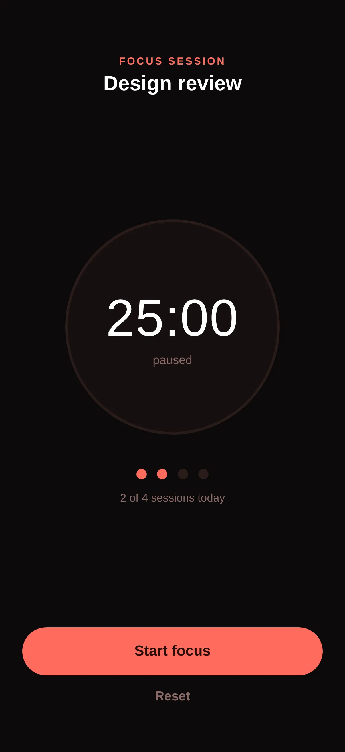
Code · 1 file
React Nativeimport React, { useEffect, useRef, useState } from 'react';
import { View, Text, Pressable, StyleSheet, SafeAreaView } from 'react-native';
export default function App() {
const [secs, setSecs] = useState(25 * 60);
const [running, setRunning] = useState(false);
const [done, setDone] = useState(2);
const timer = useRef<any>(null);
useEffect(() => {
if (running) {
timer.current = setInterval(() => setSecs((x) => (x > 0 ? x - 1 : 0)), 1000);
}
return () => clearInterval(timer.current);
}, [running]);
const mm = String(Math.floor(secs / 60)).padStart(2, '0');
const ss = String(secs % 60).padStart(2, '0');
return (
<SafeAreaView style={s.safe}>
<View style={s.top}>
<Text style={s.kicker}>FOCUS SESSION</Text>
<Text style={s.task}>Design review</Text>
</View>
<View style={s.center}>
<View style={s.dial}>
<Text style={s.time}>{mm}:{ss}</Text>
<Text style={s.timeSub}>{running ? 'in progress' : 'paused'}</Text>
</View>
<View style={s.dots}>
{[0, 1, 2, 3].map((i) => (
<View key={i} style={[s.dot, i < done && s.dotOn]} />
))}
</View>
<Text style={s.dotsLabel}>{done} of 4 sessions today</Text>
</View>
<View style={s.footer}>
<Pressable onPress={() => setRunning((r) => !r)} style={({ pressed }) => [s.btn, pressed && { opacity: 0.85 }]}>
<Text style={s.btnText}>{running ? 'Pause focus' : 'Start focus'}</Text>
</Pressable>
<Pressable onPress={() => { setSecs(25 * 60); setRunning(false); }} style={s.reset}>
<Text style={s.resetText}>Reset</Text>
</Pressable>
</View>
</SafeAreaView>
);
}
const s = StyleSheet.create({
safe: { flex: 1, backgroundColor: '#0C0A0A' },
top: { paddingTop: 64, alignItems: 'center' },
kicker: { color: '#FF6B5C', fontSize: 12, fontWeight: '700', letterSpacing: 2 },
task: { color: '#fff', fontSize: 24, fontWeight: '800', marginTop: 6 },
center: { flex: 1, alignItems: 'center', justifyContent: 'center' },
dial: { width: 250, height: 250, borderRadius: 125, borderWidth: 3, borderColor: '#2A1C1A', backgroundColor: '#161010', alignItems: 'center', justifyContent: 'center' },
time: { color: '#fff', fontSize: 60, fontWeight: '200', letterSpacing: 1, fontVariant: ['tabular-nums'] },
timeSub: { color: '#8A6A66', fontSize: 14, marginTop: 6 },
dots: { flexDirection: 'row', gap: 12, marginTop: 40 },
dot: { width: 12, height: 12, borderRadius: 6, backgroundColor: '#2A1C1A' },
dotOn: { backgroundColor: '#FF6B5C' },
dotsLabel: { color: '#8A6A66', fontSize: 13, marginTop: 14 },
footer: { paddingHorizontal: 26, paddingBottom: 40 },
btn: { backgroundColor: '#FF6B5C', borderRadius: 30, paddingVertical: 18, alignItems: 'center' },
btnText: { color: '#2A0E0A', fontSize: 17, fontWeight: '800' },
reset: { paddingVertical: 16, alignItems: 'center' },
resetText: { color: '#8A6A66', fontSize: 15, fontWeight: '600' },
});
Machine endpoints
- Manifest (JSON):/designs/sprint-focus-timer/manifest
- Registry alias:/r/sprint-focus-timer.json
- File tree:/designs/sprint-focus-timer/files
- Download bundle (.zip):/designs/sprint-focus-timer/bundle.zip
- Bundle JSON Schema:/schema/vp0-bundle.v1.json
- Registry index (all designs):/registry.json
Open, CORS-enabled, no key. React Native is the default target; append ?target=swiftui where SwiftUI is available.